Its been too long…
May 8, 2018
…since I’ve published something here. Hello again!
My focus lately has been on my ‘other’ job, the one that helps support my art. That said, it’s not like I’ve been ignoring the artwork! My watercolor workshops every 2 weeks give me a time where I can dip my brushes in water, and share my training and ideas with “new” painters. To find out more about my workshops, click here: “Every Other Saturday Morning Watercolor Workshops”.

“Layers”, “Poppies” and “Loop de Lou” silk scarf patterns
And I’ve been working on designing and dyeing scarves, like the ones above. I’ll be showing them at the annual Balboa Island Artwalk on Sunday, May 20th. Its a lovely, if long, day, along the South Bayfront walk of Balboa Island in Newport Beach, CA. And this year I’ll only be showing my scarves. I years past I’ve shown my paintings too, but I’m going light this year, nothing framed!

Oh, and my hand-embellished, 100% cotton pillowcases. All in permanent dyes, and machine washable to boot.
So come to the Artwalk, Sunday, May 20th, on Balboa Island. Or if you’re too far away to come enjoy a lovely day walking around Balboa and seeing all sorts of lovely, hand-hewn artwork, you can find them all online on my online shop.
Want to know about getting to and where to park? click here: Balboa Island Artwalk
Ask and ye shall…
August 8, 2017
Be inspired. I’ve been falling in love with figs for the past year or so. I mean, I’ve loved them, especially a la Newton, since forever. I had relatives who used to live in Newton, MA, for crying out loud. Friends who had a restaurant in St. Helena years ago had a tree in their back patio, and they’d serve a fig pasta with gorgonzola that was to die for. There’s even dried figs with jack cheese & peanuts. Or wrapped in bacon. OK, I’m getting hungry writing this.
What I also have always loved is the shape of the fig. Pear-like, but smaller, and more squat. Sexy, though. The Venus of Willendorf of fruit, if you will. I made my annual holiday embossed card last year of figs.

Why? Well, around this time of year is when they ripen, and people post pix of their figs. Here’s a selection of recent photos friends have posted of their own crops:

thanks to Lisa, Cris, Barry & Sandy
These really whetted my appetite, quite literally with that green-fig cake. The yellow ones are evidently called Tiger Figs. I like to have the real object in front of me when I paint. I urge my students to do the same thing. Its a whole different perspective to have that 3-dimensional thing there to paint, to see how the light falls on it, see how it is fully shaped, and what those surface colors and textures look like up close. I tried to find some at the local grocery stores, but could only find the small, black variety.
So I put out a call out to local peeps on Facebook, to see if anyone would share their bounty for the sake of my making a painting or two. I’ve got figs rolling in! Thanks to all who responded! Keep an eye out for the painting(s).
Succulents
April 28, 2017
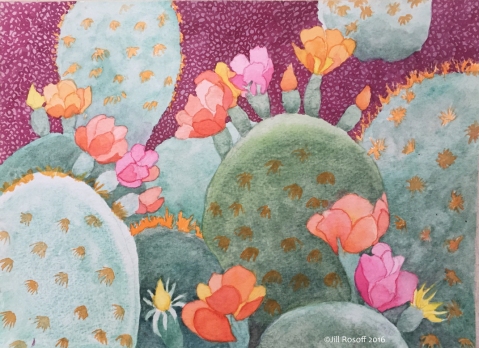
Cactus Flowers, ©Jill Rosoff 2016
I technically live in a desert, although a friend modified that for me a couple of weeks ago, we actually live in a savanah. I’m not sure which is more accurate, to be honest, but I do know I’ve grown up with lots of succulents around. They’re usually not very colorful, a dull, dirty celadon or chromium green. Except at certain times of the year, and this year we’ve had a lot of badly needed rain. So this piece, while I completed it late last year, is a celebration of the outrageous bloom we’ve been enjoying lately because of the rain, and of one of my favorite in the cactus family, the prickly pear. Those bright blossoms juxtaposed against those dull greens just sets me going. I’m sure I’ll be doing more paintings of these.
For those of you in Southern California, I’ll be showing my watercolors and my Silk Scarves at the Balboa Island Artwalk on Sunday, May 21st. All day, along the bayfront walk of Balboa Island, Newport Beach, CA.
Moon Shots
December 7, 2016
I’ve been taking photos at night of the moon and the clouds and silhouettes of trees with my iPhone. At first I was just doing it to see what they’d look like, but I’ve really been enjoying it, seeing something, pulling over if I’m driving, and seeing what my iPhone can capture, and publishing them via Instagram. Sometimes I’m really pleased with the outcome, sometimes not.
The first one was of the moon through the jacaranda trees off my porch. I loved the light of the moon creating the silhouette of the trees. And the lights of the house next door, lighting it up. So I’m continuing the exploration.
Georgia Always Inspires
June 9, 2016
I came across this posting about a monograph of Georgia O’Keefe’s watercolors, in anticipation of a show of her work at the Tate in London. Oh! to be able to see it in London! This painting isn’t in this monograph. But it’s a favorite of mine by her, and in the same vein of her works.
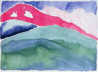
“Pink and Green Mountains #1”, 1917, Georgia O’Keefe
What I find really compelling about these paintings, both as a painter and as a teacher, is that they are so gestural. See how the brushstrokes are simple and straight-forward strokes. Gestures. Not a lot of fussing, very minimally worked. Confident in the application of the paint. I rarely do figures in watercolor, and looking at the figure works in this make me wonder why.
Results
June 8, 2016

This is one of the sketches I did back in my studio after the trip to the Flower Fields, from my last posting. As much as the trip turned out so different than my expectations for it were, I’m really enjoying making paintings from the photos I took. Lemonade out of lemons. You just never know!
The Flower Fields in Carlsbad
April 28, 2016

Ranunculus, from the rows of purples and reds up to the white ones.
Yesterday I drove to Carlsbad (CA) to meet up with an artist friend to see and paint the flower fields. Carlsbad is in northern San Diego county, and has been know for the vivid colors that bloom each spring of the flowers that are grown there. When I was a teen, my family would drive to Tijuana for the day to go shopping. As we got to Carlsbad, the 5 split through the fields, and intense colors covered the land on both sides of freeway. Back then you could get off the freeway and simply go walking in the fields, to get up close and personal with the growing blooms. We never stopped though, as were on our way to a different adventure. But I had dreams of going there to sit in the fields and paint the flowers.

Thank goodness for zoom-in feature on my cell phone!
A few weeks ago I shared a photo I found of the fields on Facebook that I’d seen. Laura, my fellow artist friend, emailed me with the idea to go paint and sketch and paint in the fields. At last, a dream would be realized. Yesterday was the day, and though the flower fields are down to a few acres these days, and only ranunculus are planted (thought I love ranunculus), and you have to pay to get in to see them, we both packed up our art supplies and hats in bags and went, ready to plop ourselves down in the furrows between the rows of flowers and make art.
Or so we thought. They don’t let anyone walk through the rows of flowers anymore (frowny face)! There’s a big irrigation ditch surrounding each field, that’s a few feet wide and a couple feet deep. Sigh! So we couldn’t plop ourselves down in the furrows and paint. That said, every dozen rows or so they had little portable foot-bridges placed over the ditch, and about 20’ of ‘path’ cordoned off into the field.

The pink ranunculus rows
But there wasn’t much room to plop down in. I’d been so looking forward to literally getting down and dirty in the flower plants and painting or drawing. But it was not to be. We sat on a bench for awhile and chatted about the business of art, swapping stories of things we are each doing, gazing at the flowers. And I got a little bit of sunburn where I’d missed getting sunscreen on as I was driving down. But I did get a few photos lovely photos.
I’m starting to work on some watercolor sketches. And to see how I can turn them in to new scarf designs.
#flowerfields #ranunculus #freshoffthedrawingboard #rosoffartworks
Pigments
March 20, 2016
Being a colorist at heart, I’ve always been curious in seeing raw pigments and learning about where the colors come from, be it minerals or plants, or those that are created in a lab. My watercolors are infused with color. In my workshops I show my students ways to mix and layer colors to create richer, glowing colors, rather than using color right out of the tubes. I know there are plenty of painters who use specific palettes of color, limited to a small assortment of colors to create a certain tone to their paintings. I’m a color hog, the more the merrier. I never use any browns or black, and rarely grey. I mix them or layer them using all sorts of colors to get wonderful rich colors in my paintings.

“Shutters” Original watercolor on paper. 14″ x 14″. Architecture Collection. Study of classic tuscan windows, shutters and wrought iron. Orange, yellow and plum colored walls with green and blue shutters, the sky reflected in the window glass. ©Jill Rosoff 2005
And I am curious about where pigments come from. Typically they come from plants or minerals, and sometimes animals. Imagine grinding up a lovely piece of lapis lazuli to get that specific blue in your painting! Blues are purples were most expensive, so its no surprise why they are associated with royalty. With the Industrial Revolution, color and pigments could be developed in labs, and more especially after the Scientific Revolution in the 18th C.
I just found this article on My Modern Met about a lab at Harvard that has a collection of over 2,500 pigments from around the world, and you can go see them. Its the Forbes Pigment Collection at the Straus Center for Conservation and Technical Studies, part of the Harvard Art Museum. They have the pigments there to use in art conservation work, to be able to match colors of old paintings that are being maintained and preserved.
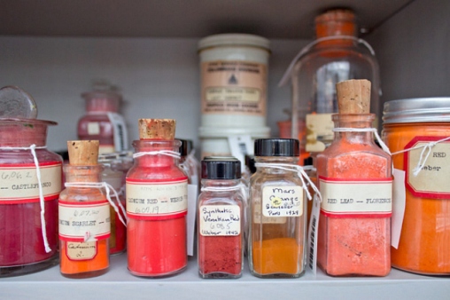 photo from My Modern Met, colors from the Forbes Pigment Collection
Seeing this article made me wistful for an art supply store I went to when I was studying printmaking in Florence way too many years ago. Its called Zecchi Colori, on via della Studio (evocative name, no?). Head a couple of blocks toward the Arno from the Santa Maria del Fiori, the Cathedral that dominates Florence’s skyline, Zecchi is on the right side of the street. The first time I went in there I thought I’d died and gone to heaven because around the perimeter of the store on the top shelf of the supplies were huge glass jars of pigments, bright, intense, glorious. I never did get a photo of them, seems ridiculous since I was so taken with them that I just never took a photo. I did by a crock, though! But I think I need to get into that lab at Harvard…

Majolica crock from Zecchi Colori, Firenze. Its sitting on a new still life of fruit and vegetables that’s in process.
Some Inspirations This Week
February 12, 2016
Earlier this week I got to see “Red”, the Tony-award winning play about one of my favorite painters, Mark Rothko. In the first act there’s a terrific back-and-forth between Rothko and the young artist he’s hired to be his studio assistant, of different things colored red. Its a verbal panoply of all things red, and in my mind’s eye as I visualized each thing they mentioned: tomatoes, blood, lips, cherries, apple, red pepper, rose, red hair, beets, lobsters (cooked), sunsets, strawberries, pomegranates, poppies, I saw all those different versions of red: cadmium red, alizarin, vermilion, scarlet, carmine, crimson, garnet and more. All so different, and all so red. I use them a lot. Its a fun exercise, and illustrates so well the differences between warm reds and cool reds to boot. In my workshop 2 nights later we started doing a similar thing, so they could all start envisioning different variations of just the one color.


Its a fun exercise, and illustrates so well the differences between warm reds and cool reds to boot. In my workshop 2 nights later we started doing a similar thing, so they could all start envisioning different variations of just the one color.
Next: I was born in the Year of the Monkey, so it’s ‘my’ year according to the Chinese zodiac calendar. There have been some interesting illustrations for it online on various social media sites, but I wanted to share one with you all especially. A friend of mine, Kay, who does sumi-e, created a lovely tribute to this year here.
And finally, speaking of reds, have a lovely Valentines!

A Bright Colors Devotee Using Neutrals
November 10, 2015
My palette in my paintings and in my scarves is typically bright colors. One of the six-week workshops I teach through the local junior college’s community education department is about how being strategic with color combinations can actually enliven colors. So I find it particularly intriguing to be developing a whole set of color ways for my scarves that are in more neutral colors. Here are two I did yesterday, pinned to the canvas-covered board while they are drying.

“Loop de Lou” design, in coffee and brown, and in grey and black.
They are pretty interesting, yes? Now, I’m a sincere coffee devotee, so the first color way was pretty much a “duh” for me. This one will look good with black, on white, on oranges, on light blue, on lavender, you get the idea. The one on the right, the grey, is a nice, cool grey, and will go with everything. Imagine it on red! And as much as these are perfect for winter colors, they’ll be perfect accents for spring and summer colors! Imagine they grey one on red!
Get my scarves online in my Etsy shop.
 Click here to go to Rosoff Artworks